
Overview.
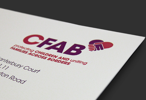
Let’s put our hands together for Lindsay, who created a memorable (and meaningful) new corporate identity for this highly respected organisation. CFAB is an international charity that promotes and protects the rights of children and vulnerable adults across international borders.
Identity.
A clean, bold sans serif font was used for the typography to reflect the charity’s direct, no-nonsense approach. Lindsay introduced a heart icon to reflect the organisation’s role in helping real people in difficult circumstances. This, combined with the use of warm colours, gives the logo a feeling of inherent humanity.