
Overview.
This Borough Council had an image problem. There were no comprehensive brand guidelines for suppliers and staff to follow, and as a result, there was design anarchy. There were logos on the left, logos on the right, small headlines, big headlines, oh, it made your head spin. Lindsay was commissioned to review all aspects of the council’s visual identity, including typography, colour palettes, publication layout grids, signage and stationery. He developed brand guidelines and produced two brand books to ensure that internal staff and external suppliers were working in harmony. The refreshed look and feel is in keeping with their modern outlook, and has been very well received.
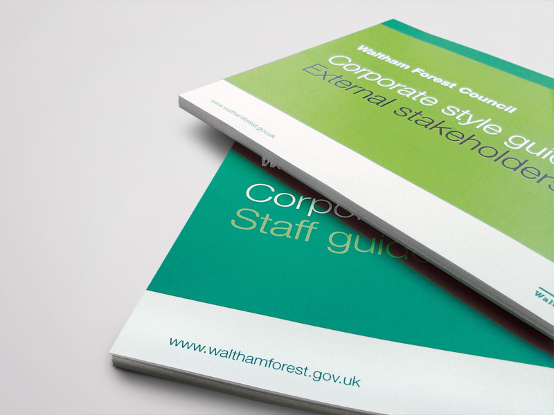
Brand books (outers).

Two brand books were created; one for external agencies and one for staff.
Brand books (inners).


An interactive pdf was produced for each brand book, giving people quick and easy access to the relevant information.