
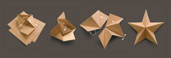
Once upon a time, there was a plain, brown, square piece of paper. How he envied all his friends in Paperland, with their bright colours and fancy patterns. But one day, Lindsay, our Design Director, won a pitch to create a new visual identity for Government Skills, a government agency and division of the Cabinet Office. He used the ancient Japanese art of origami as a theme to visually demonstrate the concept of skills development. The idea behind it was that as the practitioner attains more skills, they can complete more elaborate models from a basic starting point. Models such as birds and stars were used for their positive symbolism. A very ordinary, plain, brown square of paper was transformed into a dazzling swan. A campaign was born and well received. And everyone lived happily ever after…
Report editing.
Our Words Director, Catherine, edited a lengthy report for Government Skills, blending the voices of a number of different contributors, so that the work appeared to be written by one author and had an authoritative, confident tone. Here’s a quick summary: skills are good and we need more of them.
Identity.

Wrap and strategy report cover.
The newly branded agency was relaunched at the Civil Service Live event at the QE2 Conference centre in Westminster. Playing on the theme of origami, a wrap made from a single sheet of paper was used to create a folder for marketing material.
Folders.

Regional inserts.

Display.